

iControl: Easy Widgets Themes
Fancy keyboard for theme apps
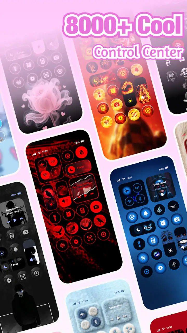
When I tried iControl: Easy Widgets Themes, I found that its real appeal is not simply adding a decorative widget to an Android home screen. The more useful idea is turning several small parts of the phone’s appearance into one coordinated visual setup: control-panel styling, widget themes, and fonts working together instead of looking like unrelated downloads. That makes it especially interesting for anyone who wants a more deliberate home screen without rebuilding the entire phone interface.
This is a free personalization app from Fancy keyboard for theme apps, aimed at users who enjoy changing the visual character of their device. It has reached over ten million installs and holds a 4.7 average from around fifty-three thousand ratings, which tells me that the concept has broad appeal. Still, popularity alone does not make a customization tool suitable for everyone. Its value depends on how much control you want, how often you change your phone’s look, and whether you are comfortable with a themed layer rather than relying only on Android’s standard options.
What the coordinated theme approach changes
The central capability is the combination of widgets, control-panel visuals, and fonts in one personalization experience. With ordinary Android customization, I often end up choosing a wallpaper from one place, a widget from another, and a font or keyboard style somewhere else. Each item may look good by itself, but the final screen can feel pieced together. iControl: Easy Widgets Themes is designed to reduce that mismatch by treating those elements as parts of the same visual decision.
That sounds like a small distinction, but it changes the way I approach customization. Instead of asking, “Which widget should I install?” I can think in terms of a complete mood for the phone. A clean, restrained layout benefits from matching typography and controls, while a more expressive setup can use the same visual language across the home screen. The result is not necessarily more functional than a standard Android screen, but it can feel more personal and intentional.
I also like that the app sits in the personalization category rather than pretending to be a productivity replacement. Its purpose is visual refinement. It can make frequently seen parts of the phone more enjoyable, but it will not automatically improve time management, battery life, or the underlying Android experience. That distinction matters because users sometimes expect a themed interface to transform how the phone works. Here, the main effect is how the phone looks and feels during repeated everyday interactions.
Latest News

Uber Eats Under Pressure: What Happens When Delivery Goes Wrong

How QR & Barcode Scanner Adapts to Android and iOS Innovations

Why Waze Navigation & Live Traffic Is Your Essential Travel Companion
CapCut Mastery: Unleash Hidden Features for Pro-Level Editing

How OS Updates Enhance Roblox Adventures

Teacher Simulator: Exam Time Turns Quick Classroom Judgments into a Repetitive Loop
The app is marked for Teen users, so I would still treat it as something to review carefully before handing it to a younger user. The age label is not a substitute for checking the actual experience on your own device, especially if you are sensitive to optional purchases or prefer a completely minimal setup.
Why fonts matter more than they first appear
Among the available customization areas, fonts can have an outsized effect. A widget may occupy only a small portion of the screen, but its lettering determines whether information feels calm, playful, compact, or visually heavy. When the type style agrees with the widget and control-panel theme, the home screen looks more coherent. When it does not, even a polished widget can seem out of place.
My practical advice is to begin with the font and overall tone rather than adding every visual option at once. Choose the kind of reading experience you want first, then build the widget arrangement around it. This avoids a common customization mistake: creating a screen that is attractive in a preview but tiring to read during a quick glance. A decorative style may work for a secondary page, while a clearer style is better for the screen I check throughout the day.
Gallery
How I used it in practice
The most sensible workflow is to treat the app as a design kit rather than a button that instantly fixes the home screen. I would start by deciding which page needs attention. If the main page already contains essential shortcuts, I would avoid changing everything immediately. Instead, I would test one themed widget and observe whether it fits the existing wallpaper, icons, and spacing.
That gradual approach is important because visual customization can create friction when too many elements change together. A home screen may look balanced in a selection view but feel crowded once notifications, app labels, and real shortcuts are present. By changing one area first, I can tell whether the design is genuinely useful or merely attractive in isolation.
After selecting a direction, I would adjust the widget placement around the way I actually hold the phone. A large visual element placed where my thumb normally lands can make the screen less comfortable, even if it looks symmetrical. I prefer to reserve the easiest reach for the shortcuts I use most, then place decorative or glanceable information farther away. This is one of the less obvious trade-offs of themed layouts: visual balance and physical convenience are not always the same thing.
The control-panel styling deserves a similar test. A themed control area can make the phone feel more unified, but I would not judge it only by screenshots. The important question is whether the controls remain easy to recognize when I am in a hurry. If a visual treatment makes familiar actions less obvious, I would keep the theme for the home screen and use a simpler arrangement for quick access.
Another useful workflow is to create a “daily” look and a “display” look mentally, even if I do not switch between them often. The daily version should prioritize legibility and reach. The display version can be more decorative for a second home page or a device used mainly for media and browsing. This lets me enjoy the app’s visual strengths without forcing every part of the phone to follow the most stylized design.
A realistic morning-to-evening example
Imagine checking the phone first thing in the morning for the time, weather information, and a couple of frequently used apps. A coordinated widget theme can make that glance feel cleaner because the typography and surrounding controls do not compete for attention. During the day, the benefit is less about admiration and more about recognition: I know where to look because the layout has a consistent visual hierarchy.
Later, when I am using the phone for messaging or reading, the font choice becomes more noticeable. A style that looked distinctive during setup may feel distracting after repeated use. In that situation, I would keep the themed widget but choose a less dramatic type treatment. This is where the app’s collection-based approach can be useful: it encourages experimentation, but the best final setup may be a restrained combination rather than the most eye-catching one.
At night, a busy design can become especially irritating if I am trying to check one detail quickly. I would therefore avoid filling the first page with multiple decorative elements. Keeping one strong widget and leaving breathing room around it often gives the theme more impact than stacking several similar items. The app works best when it supports a clear layout, not when every available space is treated as an opportunity for decoration.
Where the app feels strongest
The strongest scenario for iControl: Easy Widgets Themes is a phone that feels visually inconsistent after many years of adding individual customization tools. If the wallpaper, icons, widgets, and text styles all come from different sources, the device can look unfinished even when each choice seemed reasonable at the time. This app offers a more focused way to bring those decisions closer together.
It is also a good fit for someone who changes their home screen with the seasons, personal projects, or different moods. A coordinated theme can make a familiar device feel refreshed without requiring a new launcher or a complete change to how apps are organized. I see particular value for users who enjoy visual design but do not want to spend a long time assembling separate components.
Another strong use is creating a dedicated second page for a particular purpose. For example, I might use a calmer design for everyday shortcuts and a more expressive theme on a page used for photos, music, or casual browsing. The benefit is that the visual change has a clear role instead of making the entire phone equally busy.
People who share screenshots of their home screens may also appreciate the consistency. A coordinated arrangement photographs better than a collection of mismatched elements, because the relationship between the widget, lettering, and controls is visible immediately. That said, I would still prioritize readability over how the screen looks in a screenshot. A phone is something I use repeatedly, not just something I display once.
Small decisions that improve the result
Use one dominant visual style and let the surrounding layout stay quiet. This gives the themed widget room to stand out without making the screen feel overloaded.
Test the design with real app notifications and changing content. A widget that looks balanced with short sample text may become crowded when actual information is longer.
Keep essential shortcuts in familiar positions. Personalization is most successful when it changes the appearance without forcing me to relearn every reach and glance.
Compare a decorative font with a clearer alternative before committing. The more often a screen is read, the more valuable comfortable lettering becomes.
These steps may sound basic, but they expose the difference between selecting a theme and living with one. The app can provide the visual ingredients; the quality of the final result depends on how carefully I combine them with the phone’s existing layout.
The trade-offs I noticed
The first trade-off is simplicity versus variety. A collection of styles is enjoyable when I want to experiment, but too much choice can slow down the process. I can spend more time comparing appearances than actually improving the screen. For users who want one fixed layout and never plan to revisit customization, a built-in Android widget and wallpaper may be the more efficient answer.
The second is appearance versus system consistency. A themed control panel may feel more distinctive than the default interface, but Android’s standard controls are familiar and predictable. If I regularly need to access settings quickly, I prefer not to sacrifice recognition for visual novelty. The app is better viewed as an enhancement for people who enjoy a designed experience, not as a universal replacement for every standard element.
There is also a cost consideration. The app is free to begin with, while in-app purchases range from $4.99 to $40.99 per item. That range makes it important to decide how deeply I want to customize before spending anything. A free starting point is useful for testing the general style, but users who want access to more elaborate choices should consider whether the visual change is worth the purchase for their own routine.
I would also be cautious about judging the app from a single attractive preview. A theme can look excellent with a particular wallpaper and icon arrangement but less convincing on another device or screen size. Android phones vary widely in display proportions and system interfaces, so the practical result may depend on how the chosen elements fit the device. I would test the most important page first and avoid purchasing a larger collection until I know the style works in daily use.
Finally, personalization can become distracting. If I keep changing the layout every few days, I may lose the efficiency that comes from knowing where everything is. The app encourages visual exploration, which is a strength for creative users, but it can also tempt me into constant tweaking. Setting a clear goal—better readability, a cleaner first page, or a coordinated look—helps keep the process useful.
How it compares with ordinary Android customization
Android’s built-in tools are usually the better choice for users who want speed, stability, and the fewest moving parts. Standard widgets are familiar, and a simple wallpaper or icon adjustment may be enough to make a phone feel fresh. If my only goal is to place a clock or calendar where I can see it, I do not need a dedicated theme collection.
Separate widget and font tools can offer more specialized control, but they also create the mismatch problem I mentioned earlier. One app may provide a beautiful widget while another controls typography, leaving me to make the final design decisions. iControl: Easy Widgets Themes is more appealing when I value coordination over highly technical, individual adjustments.
It is not necessarily the best option for someone who wants a complete launcher replacement, advanced automation, or a deeply customized system interface. Those users may prefer tools built specifically around app-grid behavior, gestures, icon packs, or extensive layout rules. This app’s strength is narrower and more approachable: it focuses on the visual relationship between selected home-screen elements.
That narrower focus is actually helpful for beginners. I do not need to redesign every behavior of the phone to see a difference. I can begin with a widget theme, evaluate the font, and decide whether the control-panel treatment belongs in the same setup. For a user who wants a visible change without learning a complex launcher, that is a reasonable middle ground.
Who will get the most from it
I would recommend it to people who notice visual inconsistency and enjoy refining small details. It is particularly suitable for someone who wants a home screen with a recognizable personality, whether that means calm and minimal, playful, or more decorative. The coordinated approach is also useful for users who have tried individual customization apps and felt that the pieces never quite matched.
It is less suitable for anyone who regards the home screen as a purely functional tool. If I want the fastest access to apps, the clearest standard controls, and no temptation to adjust fonts or widgets, the extra layer may not justify itself. The same applies to users who dislike optional purchases or prefer not to spend time comparing visual styles.
Device compatibility is another practical point. The current version is 1.6.7.0528 and requires Android eight or later, so owners of supported phones can consider it without needing a very recent operating system. I would still check how the chosen design fits my particular display and existing Android skin before making a major change. The minimum requirement tells me the app is accessible across a broad range of devices, but it does not guarantee that every screen will produce the same visual result.
For iPhone users, this review is not a reason to assume the same experience will carry over unchanged. The app’s listed minimum operating system is Android eight or later, so I would treat it as an Android-focused personalization choice rather than a general mobile theme solution.
My recommendation after using the concept
What I appreciate most is the app’s emphasis on visual coordination. It gives me a way to think about widgets, fonts, and control-panel styling as one design problem instead of three disconnected tasks. That can make an older or visually messy home screen feel more considered, especially when I apply the changes gradually and protect the shortcuts I use most.
My main caution is to keep expectations realistic. This is a personalization app, not a performance upgrade or a replacement for Android’s entire interface. The free entry point makes it sensible to explore first, but the available purchases mean I would decide on a specific purpose before paying for additional items. I would also choose legibility and reach over a dramatic screenshot whenever the two conflict.
For me, the best reason to try it is the coordinated treatment of widgets, fonts, and controls. That single capability has a real everyday effect: it can make the phone easier to recognize as my own and more pleasant to glance at, provided I avoid overcrowding it. If you enjoy personalizing your Android device and want a unified look without committing to a complex launcher, this free app is worth exploring. If you prefer the standard interface exactly as it is, its visual benefits probably will not outweigh the extra choices and possible purchases.
FAQs for iControl: Easy Widgets Themes
What is iControl: Easy Widgets Themes and what does it offer?
iControl: Easy Widgets Themes is a versatile app designed to customize your iOS device with a range of widgets and themes. It allows users to personalize their home screen with aesthetically pleasing designs, offering a variety of widget types including weather, calendar, and more. The app aims to enhance the user interface experience by providing easy-to-use customization tools.
Is iControl: Easy Widgets Themes free to use?
iControl: Easy Widgets Themes offers a free version with basic features and a selection of themes. However, to access premium themes, widgets, and advanced customization options, a subscription or one-time purchase may be required. Users can choose to upgrade for a more comprehensive and ad-free experience.
How user-friendly is iControl: Easy Widgets Themes for beginners?
iControl: Easy Widgets Themes is designed with user-friendliness in mind, offering an intuitive interface that makes it easy for beginners to navigate. The app provides step-by-step guides and tutorials to help users set up and customize widgets and themes without needing prior experience. This ensures a smooth onboarding process for all users.
Does iControl: Easy Widgets Themes affect device performance?
iControl: Easy Widgets Themes is optimized to run efficiently on iOS devices without significantly impacting performance. The app is designed to use minimal resources, ensuring that it does not drain battery life or slow down your device. Users can enjoy enhanced customization without compromising on device speed or performance.
Can I create custom widgets using iControl: Easy Widgets Themes?
Yes, iControl: Easy Widgets Themes allows users to create custom widgets tailored to their preferences. The app offers a variety of tools and design options, enabling users to personalize widget backgrounds, fonts, and colors. This feature ensures that users can create unique home screen layouts that reflect their personal style.
Pros
- Highly customizable widget options.
- Seamless integration with iOS themes.
- User-friendly interface design.
- Regular updates and new features.
- Low impact on device performance.
Cons
- Limited free version features.
- Occasional minor bugs reported.
- Requires iOS 14 or later.
- In-app purchases can add up.
- Limited support for older devices.


